Spyder Checkr Video Review: A Must-Have Tool for Video Calibration
Achieve True Color Accuracy with the Spyder Checkr Video
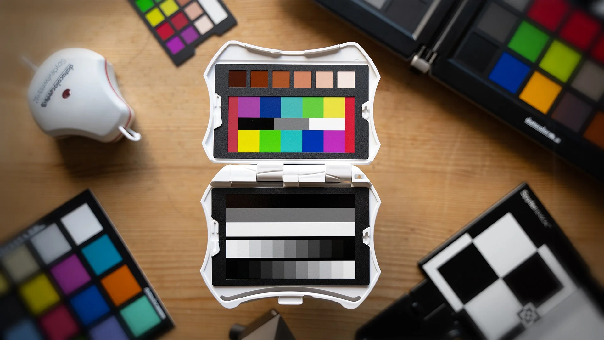
Today we're taking a look at new Spyder Checkr Video from Datacolor.
Have you ever struggled to get consistent colors across your cameras and lenses? Well, fear no more! Datacolor has got your back. The SpyderCheckr Video is going to be your best friend on set, working with vectorscopes and waveform monitors to ensure your colors are spot-on from the first shot to the final edit. With this small design for travelling, It's like having a secret weapon in your pocket, making post-production color correction a breeze.
Who is it for?

Spyder Checkr Video Case
This SpyderCheckr is perfect for those of us that shoot video as the charts and are designed to be used with Rec709.
It's ideal for anyone who shoots video and knows they need to achieve accurate color results. This is particularly important for those of us that work with brands that have products, where that need to look exactly the same on camera as they do in real life.
The SpyderCheckr Video is also a great tool for anyone that is filming with multiple different cameras and needs to match them in post-production. Using the checker makes this process incredibly simple.
What's in the box?
So inside the box you'll find:
The Spyder Checkr Video Case itself
5 replaceable color reference cards *
Attachable Lanyard
*4 of these are housed within the case & you also get an alternative patch card in a protective sleeve
This includes a:
Color Pattern Card ‒ Target and Pattern alignment rated for Rec.709
Color Patch Card ‒ Target alignment rated for Rec.709
Greyscale Card ‒ 3 large bars for White, 50% Grey and Black, plus a 22 step greyscale chart.
Grey Card ‒ this is 18% Grey for use for White Balance
Focus Star
How do you use it on set?

The Process for using the SpyderCheckr Video during production is incredibly simple.
Even though the charts allow you to actually adjust your white balance in post-production, It's always recommended to get your correct white balance in camera when possible.
To set a custom white balance in camera, you can use the grey card.
Make sure it takes up the majority of your frame, you may have to adjust your camera position or zoom in to be closer than needed for your real shot. Avoid any glare on the card by adjusting the position as needed and then use your camera's built-in white balance tool to set it for each scene needed.
Then all you need to do is gather your reference shot by filming a few seconds of the color and greyscale cards. Remember to avoid any glare on the cards by adjusting their position as needed as this can interfere with the accuracy of the results. I'd recommend filming a reference shot for each different location or setup as the lighting will change for each.
How do you use it in Post-production?
Once you've brought your footage into your editing software of choice, it's very straightforward to use the charts to ensure your footage is as color accurate as it can be.
I'm using DaVinci Resolve in this example but similar methods can be applied in Premiere Pro, Final Cut and other non-linear editing systems.
The first step is to make sure you find a clean frame with no reflections.
I've done no other corrections at this stage other than using a color space transform to bring my S-Log2 footage to rec.709.
I like to split the process up into 3 steps:
Step 1 is White Balance, Exposure and Contrast
Step 2 is Hue
Step 3 is Saturation
I create 3 separate Nodes for each of these steps.
You can create a mask around the chart to make it easier to view on the waveform.
While it's always recommended to get the right white balance in camera, you can use the chart to ensure you've got it in post-production as well.
Make your exposure and contrast adjustments until you are happy and then you can move on to step 2.
Using the checker makes it easy to see where your levels are sitting.
For this next step, switch to vector scope
(make sure 2x zoom is on & the skin tone indicator)
Again I create a mask around the correct section of the chart and then I select the Hue vs Hue curves and turn on all buttons. these correlate to the patches you can see on the chart.
I'll adjust these levels until they line up correctly and then I'll move on to adjusting the saturation with the Hue vs Sat curves and make further adjustments until the levels line up with the correct boxes.
An additional step you can take after this is to mask around the skin tone patches on the checker and ensure they are lined up with the indicator on the vector scope.
You should now have an accurate-looking image and a fantastic starting point to start your creative color grade. You will need to repeat this technical stage for each reference chart you shot. You can use Node groups or adjustment layers to apply the technical corrections to all of the various shots from each particular setup.
Design thoughts?
The design looks great to me, it fits great in your hand and it makes it so easy to hand off to talent without having to worry about them covering the patches when capturing reference shots.
Useful things to keep in mind
If you are a hybrid shooter, these charts can be switched and replaced.
Try to avoid actually touching them as they are very sensitive to fingerprints and it can impact the accuracy of the results
Possible improvements?
I'd really like to see a slightly larger version of this available one day, perhaps on a similar scale to the original Spydr check but with this new design. It would be useful as well if it could include the retractible thread to attach the Sypdr Cube, but I understand why it couldn't be included in this current version due to the size.
Overall, I'm really impressed with this new version & I'm so pleased that it's been made with video creators in mind.
Conclusion
This is a fantastic new addition to Datacolor's lineup of products and one I can see myself taking with me on every shoot going forward. It has everything you need as a video creator to ensure consistent & accurate results, all in an ideal small form factor.
I hope you found this video useful, let me know in the comments what you think of this new color checker. If you'd like to see more videos on low-budget cinematography and filmmaking in general, you can subscribe below. I'll see you next time, take care.
